Document Design
For this TECM 5280 (Designing Technical Documents) assignment, I re-designed a Word doc employee handbook into an on-screen searchable document using Adobe InDesign and Adobe Acrobat.
Background
The source document, an employee handbook for the Western Colorado University Intramural Sports Department, was a 14-page Word document. My goal was to create a document that could be shared electronically. In order to better communicate the content of the document, I also wanted my document to adhere to design principles and to include a variety of design elements. Lastly, I wanted my document to be readable and searchable when read electronically.
Project Skills
Technical Skills
Adobe InDesign
Adobe Acrobat
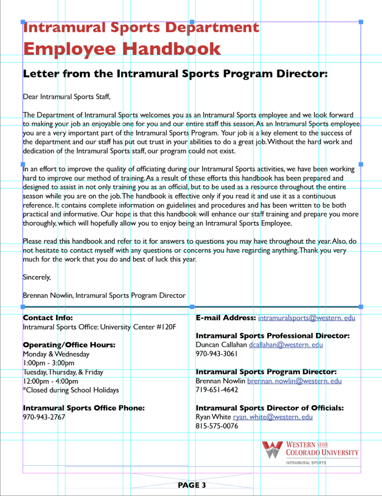
Gridding
Searchable links and TOC
Conceptual Skills
Multipage design for print and on-screen documents
Document design elements
- Layout
- Typography
- Color
- Images
Document design principles
- Contrast
- Repetition
- Alignment
- Proximity
- Focal Point
- Movement
- Unity
Process
Gridding
I designed my document on a 6×8 grid to allow flexibility and multiple page layout options. Most pages are one column but there are several two-column sections in the document. Gridding ensured that my headings, margins, headers, footers, and other elements are aligned and consistent.

Updating fonts and styles
The original document used Times New Roman. I chose a sans serif font, Gil Sans, to increase readability on screens.
The original document had inconsistent styles. Bold, italics, and underlining were all used for emphasis, but with no consistency. In my document, I used bold for emphasis. Underlining for emphasis can be confusing when used for electronic documents as it typically indicates a hyperlink.
There were headings, but heading levels were unclear because all caps, bold, and underlining were used randomly in the headings.
I determined two levels of headings based on the content of the text. I used the InDesign paragraph styles feature to create each heading.
Adding headers and footers
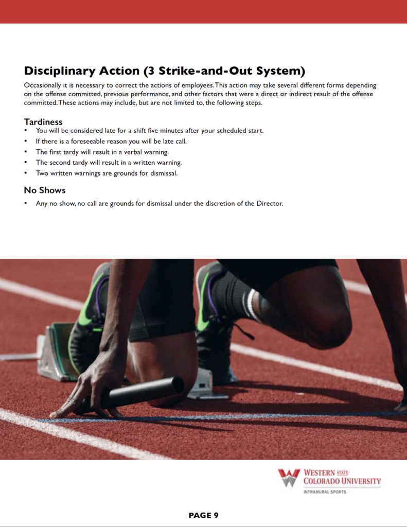
I added page numbers and the university logo to the bottom of each page and a red banner to the top of each page after the front matter.
Adding color and images for visual interest
The original document only included color on the first page, for the name and logo of the university. As mentioned above, I added the color logo to the bottom of each page and a band of color on each page.
To break up the text and increase visual interest, I also added stock photos of college-aged people participating in sports.

Using styles to create heading levels
The original document had headings, but heading levels were unclear because all caps, bold, and underlining were used randomly in the headings.
I determined two levels of headings based on the content of the text. I used the InDesign paragraph styles feature to create each heading.
Editing and proofreading
The original document contained typos. Although this isn’t part of document design, errors like this discredit any document. So I did a careful proofread of the document and fixed errors where needed.
Creating the Table of Contents
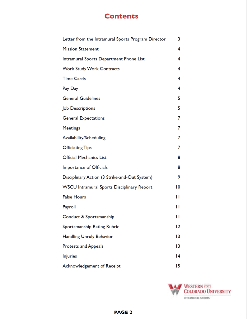
Since I had used the paragraph styles feature in InDesign to create headings, I was able to generate a Table of Contents using the InDesign TOC feature. This TOC links each topic and page number to the appropriate page in the document.

Exporting to Adobe Acrobat
Finally, I exported the InDesign document to an interactive PDF. Then I used Adobe Acrobat to add additional wayfinding and interactive features, including bookmarks and hyperlinks to emails and websites in the text.
Outcome
My multipage document will benefit the intramural sports department in the following ways:
- Increased readability and therefore higher likelihood that employees will read the document
- Reduced number of phone and in-person inquiries to the department
- Ability to distribute the document quickly, widely, and inexpensively
- Improved operations as employees are more likely to read the policies and procedures